Context
This proposal presents Deid-Kist, a conceptual Edinburgh brewery named after a Scots word for “coffin.” Embracing playful irony, the brand draws on the city’s dark history – from Burke & Hare to its ghost stories – while fitting into Edinburgh’s vibrant craft beer scene alongside breweries like Pilot, Moonwake, and Vault City.
To stand out, Deid-Kist needed storytelling-driven branding that balanced intrigue with accessibility. Rather than focusing on Edinburgh’s more gruesome tales, inspiration came from the mysterious Arthur Seat Coffins – 17 miniature coffins discovered hidden in the hillside.
“In a secluded spot on the north-east side of the hill, boys discovered a small cave in the rock, hidden behind three pointed slabs of slate. Concealed within were 17 miniature coffins.”
Exploration
The design exploration began with the coffin shape and the number 17, evoking historical depth similar to “Est. 1917.” I tested marks merging Roman numerals with coffins but was most inspired by the faces from the Arthur’s Seat figures. Mark (H) was created by dissecting the number 17, while (F) and (I) were drawn from the reference photograph using varied methods.
I selected mark (F) for its strong character and balance of horror and intrigue.
Refinement
While refining it for clarity, some of its humor was lost – so I fused the coffin and 17 elements to form a surreal, oversized face emerging from the coffin.
Brand Colours & Typography
I opted for a black and white logo to maintain its ghostly and inky appearance. The typeface used is ‘Averia Serif Libre’, a thick, soft edged typeface which matched the shapes of the face and in-keeping with the gently dark tone.
Logo Lockup
I designed landscape and stacked logo versions with scalable variations for use across cans, packaging, merchandise, and digital platforms. The logo works in both full-white and reverse, with adjustments to the coffin element for visibility on dark and light backgrounds. I also customized the lettering—modifying the ‘e’ in “Deid” and the ‘i’ in “Kist” to suggest a coffin or figure—creating a distinctive mark that can stand alone if needed.
I designed the logo to function effectively across a wide range of applications, some of which are shown here.
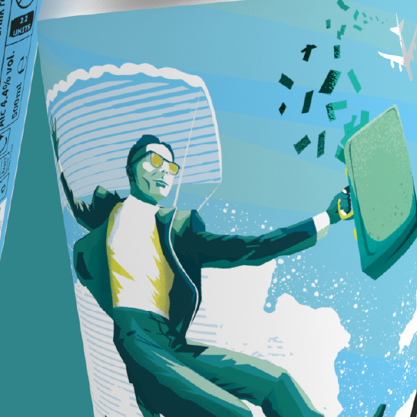
I also developed a beer can label to establish the brand’s tone and demonstrate how the logo could be applied to one of a brewery’s most significant brand assets.